NYIP Student Advisor Richard Martin has been an avid student of digital photography since it popped up in the professional world. In 2003, along with his daughter, he published an exquisite limited edition calendar for the first time combining his photographs and her poetry, printed on a home inkjet. Learning by doing, he recently produced an all-new version for 2004. It was so attractive that we asked him to share his insights with our readers. The calendar business is very forward looking, so if you'd like to create a calendar for either personal use or to sell, you'll find this article the right place to start.
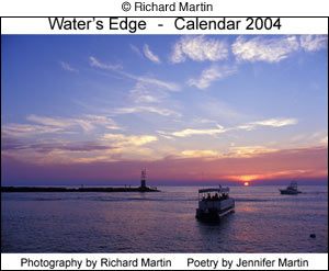
Ok, you've come back from your vacation with all those great scenic photos. Now what? Why not make a calendar? It's not that difficult to do. All you need are the images in the form of printable files, an image editor, and a decent photo printer. You'll also need some sort of program to make the month pages, like Microsoft Word or Publisher.
The first step, of course, is to decide which images you want to use and how you are going to format your calendar. Horizontal works best if the image part of the calendar is going to consist only of your images and one per page. But two or more vertical compositions can work too.
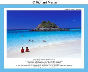
The calendar I made was actually a collaborative project with my daughter, Jennifer, an accomplished poet (ok, I'm her Dad but other people not related to her think so too). The image pages included a single horizontal photo with a short poem at the bottom of the page. The photos were all waterscapes (ocean, lake, river) that I have taken over the years in keeping with the "water" theme I decided upon for the calendar. We split the work of putting this together between us, with Jennifer doing the month pages (in Microsoft Publisher) and me handling the images and the final assembly required to create a calendar. The month pages were imported from Publisher into Adobe Photoshop where she inserted notations for holidays and color borders.
The images were all originally shot on slide film and then scanned directly into Photoshop 7 via a Nikon IV ED scanner. I saved the original scans as uncorrected TIFF files and made copies. With each copy I did some minor adjustments with the Levels and sometimes Curves tools. I also increased the color saturation slightly with those scans that were from Kodachrome slides that I selected for most of the images; the others being shot on Ektachrome 100 VS. Next, some minor sharpening with Unsharp Mask and finally sizing and setting the file resolution (360ppi) for output to the printer. These were saved as separate TIFF files.
The next step was a little tricky initially - inserting the poetry text. At first we thought we would embed the verse into some open area of the image. However, this presented a problem with some of the images and looking at this formatting later I got a sense that the poetry and the image were sort of fighting each other for attention. So to create a calendar I decided to have the verse positioned below each image. My daughter sent me the poems as Word files which I then formatted (I settled on Lucida Calligraphy font), sized, then inserted into the image window in Photoshop, using the Type tool. The exact dimensions of that window (set by first clicking on File, New, then setting the values) were 10 by 7.728 inches. This left sufficient room around both the image and the text to run a color border.
The border was fairly easy. I simply used the Rectangular Marquee Tool to create this on each side, with Feather set at 0. Then, after setting the foreground color I wanted with the Color Picker I clicked on Edit, then Fill.
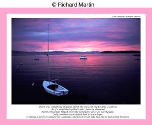
My daughter had the idea of having each month's border color keyed to the dominant tone in the image so that's what I did. Same thing for the holidays in the month pages though with a lighter hue. At the last minute I decided, at the suggestion of an editor friend of mine who saw an early version of the calendar, to insert some very brief info about where each photo was taken. She said most people would probably like to know that and I agreed. This became a short single line in small type at the top right-hand corner above each image.
These files were then saved as unflattened Photoshop (.psd) files in order to preserve the layers.
Perhaps I should mention at this point (if it's not already obvious!) that I am pretty much of a "duffer" when it comes to using Photoshop to create a calendar. We have some REAL experts here at the School but I am not one of them. I sort of consider myself to be an advanced beginner. A really knowledgeable person with this program would probably do things differently (and quicker), using a different procedure and perhaps writing some Actions for the repetitive steps. But my rough and crude way worked fine.
Next, I needed to create a front and back cover for the calendar. For the front I simply selected one of the images, and then inserted the title of the calendar "Water's Edge" above the photo and the words "Photography by Richard Martin - Poetry by Jennifer Martin" below. No color border.
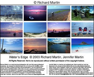
The back cover required more work. Most people when contemplating a calendar purchase like to see what all the images look like and that's typically on the back cover. So I created thumbnails of all the images and inserted them one at a time, four across in three rows. Below that I put a copyright notice and below that, some brief biographical information about myself and my daughter. Again, no color border. This and the front cover were then saved as .psd files, same as the others.
Now I was ready to print. To create a calendar you need some double-sided paper, meaning paper you can print on both sides. And it needed to be fairly heavy, not plain paper. I settled on Epson Double-Sided Matte, partly because I was outputting to an Epson printer and partly because this paper is relative inexpensive. This was the common letter-size, namely 8 1/2 by 11 inches, the largest size my printer can handle.
The printer was an Epson 820, a 6-color photo model. Ink was Epson's OEM inkset for this printer. In the printer driver I set the resolution at 1440dpi for the image pages and 720dpi for the month pages.
It's important when printing this sort of thing to make sure you flip the paper in the right direction when printing the second side. After a couple of misfires I got the sequencing right.
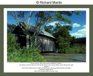
Ok, now we have a bunch of loose calendar pages. How to put it together? I needed some sort of binding tool that wasn't too expensive and after shopping around a bit settled on a GBC Presentation Binder System, an all-manual device. You merely insert the paper then press down firmly on the cover to punch the holes. I found that I could comfortably do two pages at a time without any real sweat. The actual binding, with 3/8 inch plastic combs, involves inserting the comb, pulling down a lever on each side of the machine to open the comb, lining up the holes on the pages with the comb, then closing the comb by flipping the levers back up. Low-tech and not fast but it works fine.
Interested in more then just making a calander? Apply to our Digital photography school today!


