Have you ever looked at a certain image that when viewed one way seemed to be an old lady in a rocking chair? But if you looked at the same picture from a different angle the image was that of a beautiful young mermaid? I know that I've enjoyed such visual puns and perhaps you have, too.
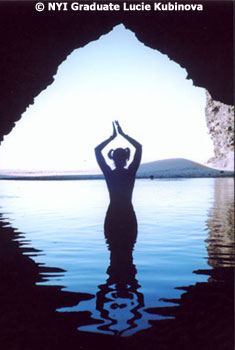
This month's photograph is in this category. It's a kind of fool-the-eye image and very cleverly done. The photographer, Lucie Kubinova, an NYI graduate who lives in California, sent us this photograph as part of her Unit Four Photo Project for our Complete Course in Professional Photography.
Questions are posed immediately. What, for example, is the subject doing? Is she dancing? Is she praying? Is she simply showing exuberance as she wades into the cool water on a hot day? Who knows? Who really needs to know? One does not always need a literal interpretation. Remember what jazz great Louie Armstrong said about his music? In his own inimitable way, he said, ìMan if I gotta 'splain (explain) it to ya, ya ain't never gonna understand it.î So, let us concede the fact that there is a certain aura of mystery about the subject of Lucie Kubinova's photograph.
That said, let us move on. How did the photographer focus attention on the subject, (the second NYI Guideline)?
The silhouette approach is the most obvious technique Lucie used. Also, note the effective use of framing as the cave or grotto neatly frames the woman. See the excellent use of the reflections in the water. The repetition of shapes and form always helps to give a three-dimensional feeling to a picture. Of course, reflections are not the only way to show repetition, but they are commonly used for this purpose.p>
Ordinarily, I'd suggest that a subject be placed somewhat off center, using the Rule of Thirds technique. The asymmetry is perhaps more pleasing to the eye usually. But there are exceptions to every rule, and the Rule of Thirds isn't a rule at all but is merely a compositional suggestion. You can use it or not use it as you see fit because your pictures are yours and you can make them your way if you want to do so.
In any case, this picture seems to be an exception to the Rule of Thirds. Here symmetry (see the central placement) seems to be more effective than asymmetry would be, don't you think? I do.
There is another point, though, that needs some consideration. What direction is the subject facing? If the picture is intended to be mysterious, then part of the mystery may lie in the answer to the way the woman is facing. But if the photographer wants us to know specifically, then she must throw a little bit of light into the foreground area for the sake of clarity. A weak fill-in flash would do the trick, I think.
Every now and then the use of negative space can be very expressive in a photograph. Negative space, for those not familiar with the term, is the space fully enclosed or partially enclosed by three-dimensional objects. For example, see the space between the woman's two arms and head. The almost perfect symmetry reminds me of a Grecian urn, the kind that John Keats wrote so eloquently about so long ago.
Also, look at the negative space created by the overhanging roof of the cave and the distant shore.
Speaking of that distant shore, I want you to notice the interesting placement of the distant mountain. The photographer could have continued the symmetrical pattern previously established, but she chose to include the mountain, thus efficiently breaking up the mass of sky that might have become a bit monotonous.
I do feel somewhat cheated, though. I think that Lucie Kubinova should have stepped back a little or used a slightly wider angle lens in order to include the left hand corner of the cave and the right corner as well.
But this is a relatively minor point. All things considered, the photographer has shown us an excellent photo this month.


