

The New York Institute of Photography is one of the world’s largest photography schools and because we are, we often publish fun and useful photography tips on our photography blog. Please enjoy!
A painter only needs at their palette before applying color to the canvas. Photographers have a different challenge, as they must locate their tones by studying a scene. Of course, this can be easy to bypass when you're thinking about shadow, highlight, depth of field, shutter speeds, and all of the other technical details that go into a photo. Still, as the great painter Kandisky said "Color is a power which directly influences the soul." To use it in your compositions can infuse your work with a new level of sophistication.
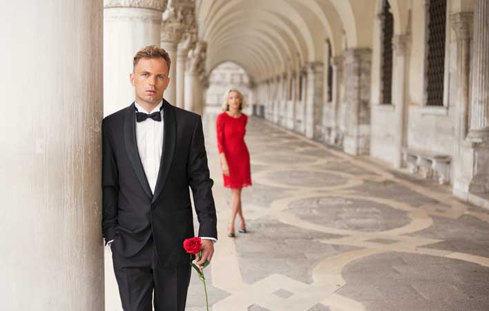
If you want to draw people into your photograph, try including just a small amount of color. This subtle method gives your subject importance by allowing it to stand out from the rest of the frame. These thoughtful compositions are aided by a different approach to photography. Instead of working to add more visual interest, you want to eliminate any competing colors, and simplify the frame. While looking through the viewfinder, check all four corners carefully for distracting elements.
Want to learn more? NYIP offers accredited photography courses online that can help you improve your hobby or start a new career. Request your free course catalog today!


