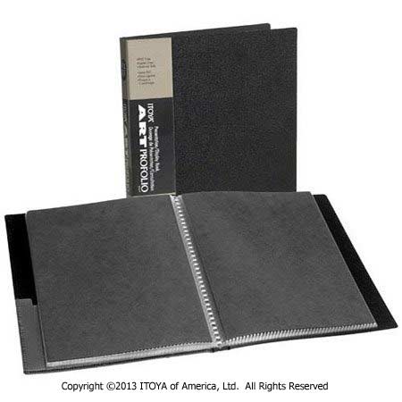
The first time I used a portfolio, it was a black leather bound book purchased from a local art supply store. It actually wasn't as large as many others you see with carrying handles, but was more compact at 8.5 x 11. Inside were 10 or 12 of my best color sports images printed by adoramapix. Each 8x10 photo was carefully placed in the "crystal view" holders designed for showcasing work. I took a deep breath while handing it to the sports photo editor in the busy headquarters office of a large New York newspaper. Before opening it to look at the first image, he paused thoughtfully, almost as if resetting an internal judging mechanism. In the background, staff writers, and editors buzzed over the Preakness race on the television.

The first photo was my strongest as I wanted to make a great first impression. This initial image should wow the viewer and make them want to see more. Similar to a horse race, it's important to get out of the gate fast, but essential to maintain a steady pace, hold the lead, and finish strong. As such, the order of the prints that followed was designed to keep his attention and show what I was capable of capturing should they hire me. About half of the photos were shot in vertical orientation, with the others horizontal. I kept these together rather than forcing him to keep turning the book back and forth. It was a small detail, but one that I felt would improve the overall viewing experience. Any web designer strives to give a visitor a great browsing experience. The same is true when creating traditional portfolios. Keep the viewer in mind and only show your best work.
I watched quietly as the Editor looked over each print, studying some from top to bottom. While this process was nerve wracking, I resisted the temptation to explain things. I had selected images that were technically sound with good exposure, sharp details, and accurate color. More importantly, the selections all showed the peak moment of action. I remained silent, and let the work speak for itself.
Many people are surprised that I could land a job with just 10 or 12 photos, but that was the magic number. This highlights an important consideration for photographers building portfolios; less is more! To bring a book of 100 images would have only taken more time to look through, and considering the high speed pace of the publishing industry, this may have worked against me. The same is true with online galleries. If you have several terrific shots of one subject, choose only the best and stash the rest. Perhaps the other frames can be used on a blog post, or marketing materials, etc.
My portfolio quickly changed to include new work as my career developed. Still, the basic structure noted above remained. Eventually the prints were replaced by a laptop with a CD, to a smaller laptop with a thumb drive, to my current offline portfolio, the iPad. I'm sure this will continue to evolve over time, but I'll always remember the book which helped to start it all.
Designing your first portfolio can be a daunting task. Making it perfect even more so. In NYIP Photography classes, you will learn not only how to take great photos, but how to put them together to create a beautiful and impressive portfolio.


